Design ideas · 6 original designs
6 link-in-bio page ideas: a Linktree alternative on your own domain

Checked by Muhammad Huzaifa
Updated
WEBHOST2026 tested in a real cart · · How I verify · 600+ users used WEBHOST2026 (Hostinger partner dashboard, 21 Nov 2026)
The short answer
- A link-in-bio page is a small mobile web page with your photo, a short bio and the handful of links you want followers to tap. You can build your own instead of using Linktree.
- Below are 6 original designs I made for this guide: creator, music and events, shop, writer, local business and newsletter-first. Each is one HTML file you can copy.
- Hosting it yourself means your own domain (yourname.com), no platform branding and full control of the design. Linktree's free plan works, but its paid plans are a monthly subscription.
- On Hostinger, Premium web hosting with a free first-year domain is $1.99/mo with code WEBHOST2026, and the same plan can host your portfolio and a shop later.
Measured: every design is one HTML file, the largest 2.3 KB, with no images, frameworks or web fonts to load.
1. Creator classic: one highlighted link, then the rest
Best for: YouTubers, food and lifestyle creators · 2 KB, one file
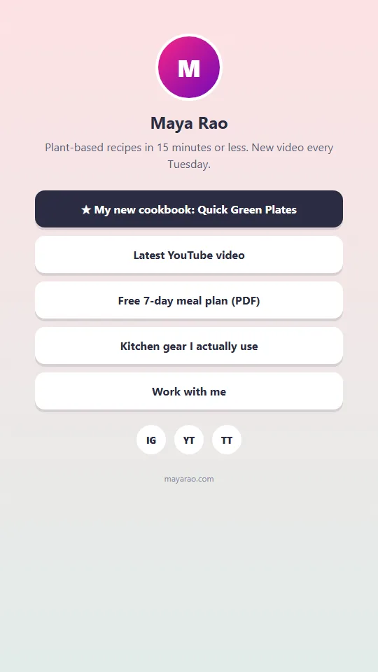
The classic link-in-bio layout is a photo, a one-line bio and a stack of buttons, with the most important link styled differently at the top. Followers tap whatever stands out first, so pin the thing you want clicked this week there.
What to copy from it
- One dark "hot" button above the rest for this week's priority
- A bio line that says what you post and how often
- A free download as the third link, to grow an email list
- Your own domain in the footer instead of a platform's logo
Watch out: More than six links and nobody reads past the fourth. Move old links off.
Open the live demo
Get the HTML and CSS (2 KB)
<!doctype html>
<html lang="en">
<head>
<meta charset="utf-8">
<meta name="viewport" content="width=device-width, initial-scale=1">
<title>Maya Rao: links</title>
<style>
  *{box-sizing:border-box;margin:0}
  body{min-height:100vh;font-family:system-ui,-apple-system,"Segoe UI",sans-serif;background:linear-gradient(180deg,#fde2e4,#e2ece9);color:#2b2d42;display:flex;justify-content:center;padding:48px 20px}
  main{width:100%;max-width:440px;text-align:center}
  .avatar{width:96px;height:96px;border-radius:50%;margin:0 auto;background:linear-gradient(135deg,#f72585,#7209b7);display:grid;place-items:center;color:#fff;font-size:34px;font-weight:800;border:4px solid #fff}
  h1{font-size:24px;margin-top:14px}
  .bio{color:#5c5f77;margin:8px 0 26px;line-height:1.5}
  a.link{display:block;background:#fff;color:#2b2d42;text-decoration:none;font-weight:700;padding:16px;border-radius:14px;margin-bottom:12px;box-shadow:0 4px 0 rgba(43,45,66,.12);transition:transform .15s}
  a.link:hover{transform:translateY(-2px)}
  a.link.hot{background:#2b2d42;color:#fff}
  .social{display:flex;justify-content:center;gap:12px;margin-top:22px}
  .social a{width:42px;height:42px;border-radius:50%;background:#fff;display:grid;place-items:center;text-decoration:none;color:#2b2d42;font-weight:800;font-size:13px}
  footer{margin-top:26px;font-size:12px;color:#8d90a8}
</style>
</head>
<body>
<main>
  <div class="avatar" aria-hidden="true">M</div>
  <h1>Maya Rao</h1>
  <p class="bio">Plant-based recipes in 15 minutes or less. New video every Tuesday.</p>
  <a class="link hot" href="#">★ My new cookbook: Quick Green Plates</a>
  <a class="link" href="#">Latest YouTube video</a>
  <a class="link" href="#">Free 7-day meal plan (PDF)</a>
  <a class="link" href="#">Kitchen gear I actually use</a>
  <a class="link" href="#">Work with me</a>
  <div class="social"><a href="#" aria-label="Instagram">IG</a><a href="#" aria-label="YouTube">YT</a><a href="#" aria-label="TikTok">TT</a></div>
  <footer>mayarao.com</footer>
</main>
</body>
</html>
2. Dark gradient page: lead with the next show
Best for: DJs, bands, podcasters and event hosts · 2.2 KB, one file
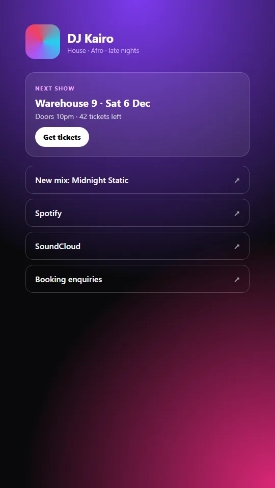
For musicians and event hosts the next date matters more than any profile link, so this design puts the next show in a card above everything else, with a ticket button. The dark gradient matches how most fans see you: at night, on a phone.
What to copy from it
- A "next show" card with date, venue and tickets left
- A gradient avatar block if you don't have a sharp photo
- Outline buttons with an arrow, so they read as links out
- Booking enquiries as the last link
Watch out: Update or remove the show card the morning after. A past date makes the page look abandoned.
Open the live demo
Get the HTML and CSS (2.2 KB)
<!doctype html>
<html lang="en">
<head>
<meta charset="utf-8">
<meta name="viewport" content="width=device-width, initial-scale=1">
<title>DJ Kairo: links</title>
<style>
  *{box-sizing:border-box;margin:0}
  body{min-height:100vh;font-family:system-ui,-apple-system,"Segoe UI",sans-serif;color:#fff;display:flex;justify-content:center;padding:48px 20px;
    background:radial-gradient(circle at 50% 0,#7c3aed 0,transparent 55%),radial-gradient(circle at 100% 100%,#db2777 0,transparent 45%),#09090b}
  main{width:100%;max-width:440px}
  .top{display:flex;align-items:center;gap:14px}
  .avatar{width:68px;height:68px;border-radius:18px;background:conic-gradient(from 90deg,#22d3ee,#a855f7,#f43f5e,#22d3ee)}
  h1{font-size:24px;letter-spacing:-.02em}
  .tag{font-size:13px;color:#c4b5fd}
  .next{margin:26px 0 18px;padding:18px;border-radius:18px;background:rgba(255,255,255,.08);border:1px solid rgba(255,255,255,.18)}
  .next small{color:#f0abfc;font-weight:700;letter-spacing:.12em;text-transform:uppercase;font-size:11px}
  .next b{display:block;font-size:20px;margin:6px 0 2px}
  .next span{color:#d4d4d8;font-size:14px}
  .next a{display:inline-block;margin-top:12px;background:#fff;color:#09090b;font-weight:800;padding:10px 16px;border-radius:99px;text-decoration:none;font-size:14px}
  a.link{display:flex;justify-content:space-between;align-items:center;color:#fff;text-decoration:none;padding:16px 18px;border-radius:14px;margin-bottom:10px;border:1px solid rgba(255,255,255,.2);font-weight:600}
  a.link:hover{background:rgba(255,255,255,.08)}
  a.link span{color:#a1a1aa}
</style>
</head>
<body>
<main>
  <div class="top"><div class="avatar" aria-hidden="true"></div><div><h1>DJ Kairo</h1><div class="tag">House · Afro · late nights</div></div></div>
  <div class="next">
    <small>Next show</small>
    <b>Warehouse 9 · Sat 6 Dec</b>
    <span>Doors 10pm · 42 tickets left</span><br>
    <a href="#">Get tickets</a>
  </div>
  <a class="link" href="#">New mix: Midnight Static <span>↗</span></a>
  <a class="link" href="#">Spotify <span>↗</span></a>
  <a class="link" href="#">SoundCloud <span>↗</span></a>
  <a class="link" href="#">Booking enquiries <span>↗</span></a>
</main>
</body>
</html>
3. Shop grid: show products, not buttons
Best for: Small shops and makers selling on Instagram · 2 KB, one file
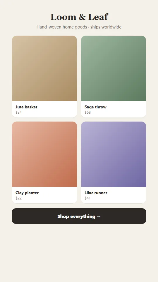
A shop link-in-bio page should show the products as a grid with prices, because a picture and a price give followers a reason to tap that a plain "Shop" button doesn't. Four items is enough; the last button takes people to the full store.
What to copy from it
- Two-column product grid with name and price
- A one-line bio that answers "do you ship to me?"
- One "Shop everything" button under the grid
- A serif logo for a hand-made feel
Watch out: Swap in real product photos and keep prices in sync with your store.
Open the live demo
Get the HTML and CSS (2 KB)
<!doctype html>
<html lang="en">
<head>
<meta charset="utf-8">
<meta name="viewport" content="width=device-width, initial-scale=1">
<title>Loom & Leaf: shop links</title>
<style>
*{box-sizing:border-box;margin:0}
body{min-height:100vh;font-family:system-ui,-apple-system,"Segoe UI",sans-serif;background:#f5f1ea;color:#2d2a26;display:flex;justify-content:center;padding:40px 18px}
main{width:100%;max-width:460px}
header{text-align:center}
.logo{font-family:Georgia,serif;font-size:30px;font-weight:700}
.bio{color:#6b645b;margin:6px 0 20px;font-size:15px}
.grid{display:grid;grid-template-columns:1fr 1fr;gap:12px}
.item{background:#fff;border-radius:16px;overflow:hidden;text-decoration:none;color:inherit;border:1px solid #e7dfd2}
.pic{aspect-ratio:1}
.item div.t{padding:10px 12px;font-size:14px;font-weight:700}
.item div.t span{display:block;font-weight:400;color:#8a8175;font-size:13px}
.p1{background:linear-gradient(135deg,#d6c3a5,#a98b62)}.p2{background:linear-gradient(135deg,#9fb8a0,#5d7a5f)}
.p3{background:linear-gradient(135deg,#e7b8a3,#c06c4c)}.p4{background:linear-gradient(135deg,#b9b3d6,#6e66a3)}
.shop{display:block;text-align:center;background:#2d2a26;color:#fff;text-decoration:none;font-weight:800;padding:16px;border-radius:14px;margin-top:16px}
</style>
</head>
<body>
<main>
<header><div class="logo">Loom & Leaf</div><p class="bio">Hand-woven home goods · ships worldwide</p></header>
<div class="grid">
<a class="item" href="#"><div class="pic p1"></div><div class="t">Jute basket<span>$34</span></div></a>
<a class="item" href="#"><div class="pic p2"></div><div class="t">Sage throw<span>$68</span></div></a>
<a class="item" href="#"><div class="pic p3"></div><div class="t">Clay planter<span>$22</span></div></a>
<a class="item" href="#"><div class="pic p4"></div><div class="t">Lilac runner<span>$41</span></div></a>
</div>
<a class="shop" href="#">Shop everything →</a>
</main>
</body>
</html>
4. Minimal text list: for writers who don't want a template look
Best for: Writers, journalists, academics and consultants · 1.6 KB, one file
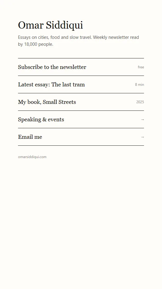
A text-only link page with ruled lines reads like a table of contents, which suits people whose work is words. It loads instantly and looks deliberate rather than templated, and small grey labels add context such as "free" or "8 min".
What to copy from it
- Serif name, sans-serif bio, nothing else above the links
- Full-width rows with a small label on the right
- Italic hover state instead of colour or shadows
- Newsletter as the first row
Watch out: Plain designs need good words. Write each link as a reason to tap.
Open the live demo
Get the HTML and CSS (1.6 KB)
<!doctype html>
<html lang="en">
<head>
<meta charset="utf-8">
<meta name="viewport" content="width=device-width, initial-scale=1">
<title>Omar Siddiqui: writer</title>
<style>
*{box-sizing:border-box;margin:0}
body{min-height:100vh;font-family:Georgia,"Times New Roman",serif;background:#fffdf8;color:#111;display:flex;justify-content:center;padding:64px 24px}
main{width:100%;max-width:420px}
h1{font-size:34px;font-weight:400;letter-spacing:-.01em}
.bio{font-family:system-ui,sans-serif;color:#555;margin:10px 0 34px;line-height:1.55;font-size:15px}
ul{list-style:none;padding:0;border-top:1px solid #111}
li{border-bottom:1px solid #111}
li a{display:flex;justify-content:space-between;padding:18px 0;color:#111;text-decoration:none;font-size:19px}
li a:hover{font-style:italic}
li a small{font-family:system-ui,sans-serif;font-size:12px;color:#888;align-self:center}
footer{font-family:system-ui,sans-serif;font-size:12px;color:#888;margin-top:28px}
</style>
</head>
<body>
<main>
<h1>Omar Siddiqui</h1>
<p class="bio">Essays on cities, food and slow travel. Weekly newsletter read by 18,000 people.</p>
<ul>
<li><a href="#">Subscribe to the newsletter <small>free</small></a></li>
<li><a href="#">Latest essay: The last tram <small>8 min</small></a></li>
<li><a href="#">My book, Small Streets <small>2025</small></a></li>
<li><a href="#">Speaking & events <small>→</small></a></li>
<li><a href="#">Email me <small>→</small></a></li>
</ul>
<footer>omarsiddiqui.com</footer>
</main>
</body>
</html>
5. Local business links: booking, call and directions on one screen
Best for: Barbers, salons, cafés, gyms and clinics · 2.1 KB, one file
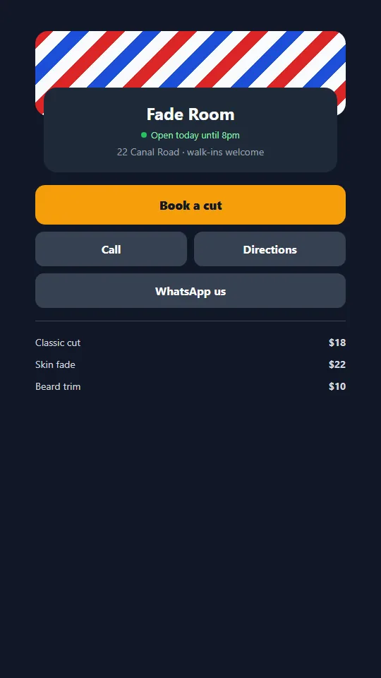
A local business doesn't need ten links. It needs a booking button, call, directions, WhatsApp and prices, all visible without scrolling. Showing whether you're open right now answers the question most people are about to ask.
What to copy from it
- "Open today until 8pm" with a green dot
- One loud booking button
- Call and Directions side by side
- A short price list at the bottom
Watch out: Opening hours here must match your Google Business Profile exactly.
Open the live demo
Get the HTML and CSS (2.1 KB)
<!doctype html>
<html lang="en">
<head>
<meta charset="utf-8">
<meta name="viewport" content="width=device-width, initial-scale=1">
<title>Fade Room barbers: book and find us</title>
<style>
  *{box-sizing:border-box;margin:0}
  body{min-height:100vh;font-family:system-ui,-apple-system,"Segoe UI",sans-serif;background:#111827;color:#f9fafb;display:flex;justify-content:center;padding:44px 18px}
  main{width:100%;max-width:440px}
  .cover{height:120px;border-radius:18px;background:repeating-linear-gradient(135deg,#dc2626 0 18px,#f9fafb 18px 36px,#1d4ed8 36px 54px,#f9fafb 54px 72px)}
  .card{background:#1f2937;border-radius:18px;padding:20px;margin-top:-40px;position:relative;margin-inline:12px;text-align:center}
  h1{font-size:24px}
  .open{display:inline-flex;align-items:center;gap:6px;font-size:13px;color:#86efac;margin-top:6px}
  .open i{width:8px;height:8px;border-radius:50%;background:#22c55e}
  .info{color:#9ca3af;font-size:14px;margin-top:6px}
  .book{display:block;background:#f59e0b;color:#111827;text-decoration:none;font-weight:900;padding:17px;border-radius:14px;margin:18px 0 10px;text-align:center;font-size:17px}
  .row{display:grid;grid-template-columns:1fr 1fr;gap:10px}
  .row a,a.link{display:block;text-align:center;background:#374151;color:#f9fafb;text-decoration:none;font-weight:700;padding:14px;border-radius:12px}
  a.link{margin-top:10px}
  .price{margin-top:18px;border-top:1px solid #374151;padding-top:14px;font-size:14px;color:#d1d5db}
  .price div{display:flex;justify-content:space-between;padding:6px 0}
</style>
</head>
<body>
<main>
  <div class="cover" aria-hidden="true"></div>
  <div class="card">
    <h1>Fade Room</h1>
    <div class="open"><i></i>Open today until 8pm</div>
    <p class="info">22 Canal Road · walk-ins welcome</p>
  </div>
  <a class="book" href="#">Book a cut</a>
  <div class="row"><a href="#">Call</a><a href="#">Directions</a></div>
  <a class="link" href="#">WhatsApp us</a>
  <div class="price"><div><span>Classic cut</span><b>$18</b></div><div><span>Skin fade</span><b>$22</b></div><div><span>Beard trim</span><b>$10</b></div></div>
</main>
</body>
</html>
6. Newsletter-first page: collect emails before sending people away
Best for: Educators and creators building an email list · 2.3 KB, one file
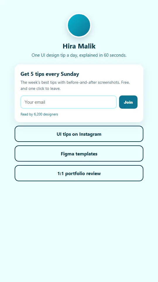
Every link on a link-in-bio page sends followers to someone else's platform. A newsletter-first page puts an email form at the top, so you keep a way to reach people even if a social account is lost or its reach drops.
What to copy from it
- An email box with a specific promise: "5 tips every Sunday"
- A reader count under the form, if it's real
- Three outline links under the form, not above it
- One paid offer (a review or template) as the last link
Watch out: Connect the form to your email tool (Mailchimp, Brevo, Kit) before going live; the demo form doesn't send anywhere.
Open the live demo
Get the HTML and CSS (2.3 KB)
<!doctype html>
<html lang="en">
<head>
<meta charset="utf-8">
<meta name="viewport" content="width=device-width, initial-scale=1">
<title>Hira Malik: design tips</title>
<style>
  *{box-sizing:border-box;margin:0}
  body{min-height:100vh;font-family:system-ui,-apple-system,"Segoe UI",sans-serif;background:#ecfeff;color:#083344;display:flex;justify-content:center;padding:44px 18px}
  main{width:100%;max-width:440px;text-align:center}
  .avatar{width:84px;height:84px;border-radius:50%;margin:0 auto;background:linear-gradient(135deg,#06b6d4,#0e7490);border:4px solid #fff;box-shadow:0 8px 20px rgba(8,51,68,.2)}
  h1{font-size:23px;margin-top:12px}
  .bio{color:#155e75;font-size:15px;margin:6px 0 22px}
  .sub{background:#fff;border-radius:18px;padding:20px;text-align:left;box-shadow:0 10px 30px rgba(8,51,68,.1)}
  .sub b{font-size:18px}
  .sub p{color:#4b6b78;font-size:14px;margin:6px 0 14px;line-height:1.5}
  form{display:flex;gap:8px}
  input{flex:1;min-width:0;border:2px solid #a5f3fc;border-radius:10px;padding:12px;font-size:15px}
  button{background:#0e7490;color:#fff;border:0;border-radius:10px;padding:12px 16px;font-weight:800;cursor:pointer}
  .count{font-size:12px;color:#0e7490;margin-top:10px}
  a.link{display:block;margin-top:12px;padding:15px;border-radius:14px;border:2px solid #083344;color:#083344;text-decoration:none;font-weight:700}
  .sr{position:absolute;left:-9999px}
</style>
</head>
<body>
<main>
  <div class="avatar" aria-hidden="true"></div>
  <h1>Hira Malik</h1>
  <p class="bio">One UI design tip a day, explained in 60 seconds.</p>
  <div class="sub">
    <b>Get 5 tips every Sunday</b>
    <p>The week's best tips with before-and-after screenshots. Free, and one click to leave.</p>
    <form id="f"><label for="e" class="sr">Email</label><input id="e" type="email" placeholder="Your email" required><button>Join</button></form>
    <div class="count">Read by 6,200 designers</div>
  </div>
  <a class="link" href="#">UI tips on Instagram</a>
  <a class="link" href="#">Figma templates</a>
  <a class="link" href="#">1:1 portfolio review</a>
</main>
<script>
  document.getElementById("f").addEventListener("submit", function (e) {
    e.preventDefault();
    this.querySelector("button").textContent = "Joined ✓";
  });
</script>
</body>
</html>
How do I publish one of these designs?
To publish a design, save the code as index.html, change the text, and upload it to your web host's public folder. It takes about ten minutes and needs no WordPress, plugins or builder.
- 1.Click "Get the HTML and CSS" under the design, then "Copy the code".
- 2.Paste it into a text editor (VS Code, Notepad) and save it as index.html.
- 3.Change the brand name, headline, prices and button links to your own.
- 4.Open the file in your browser to check it, then shrink the window to see the phone layout.
- 5.Upload index.html to your host's public_html folder. On Hostinger: hPanel → Files → File Manager.
What does every good link-in-bio page have?
Every design above follows the same 6 rules. Check your own link-in-bio page against them before you share the link.
- Six links or fewer, with the one that matters most at the top.
- A bio line that says what you do and how often you post.
- Big, thumb-sized buttons: at least 48px tall.
- Your own domain, so the link in your bio is yours for good.
- An email signup, so you can reach followers off the platform.
- Real details only: real prices, real dates, real follower or reader counts.
Questions people ask
What is the best free Linktree alternative?
A one-page HTML link page on your own domain. It costs only the hosting you'd pay for a website anyway, has no platform branding, and you control the whole design. The 6 designs on this page are free to copy.
Can I make a link-in-bio page without Linktree?
Yes. Copy one of the designs above, change the name, bio and links, save it as index.html and upload it to any web host. Then put your domain in your Instagram, TikTok or YouTube bio.
How much does it cost to host your own link-in-bio page?
On Hostinger, Premium web hosting is $1.99/mo on a 48-month term with code WEBHOST2026, including a free domain for the first year. Renewals cost more, so check the renewal price before you buy.
Is a self-hosted link page better than Linktree?
It's better if you want your own domain, no branding and a custom design. Linktree is easier if you want built-in analytics and editing from your phone without touching code. Pick based on which matters more to you.
Can I track clicks on my own link-in-bio page?
Yes. Add Google Analytics or a privacy-friendly tool such as Plausible to the page, or add UTM tags to each link so clicks show up in the analytics of the site you link to.
More ideas: every design guide · Which hosting do I need? · Hostinger coupon code